Super Helpful
Design Speak Translator
-
Put simply - how long things take. Bish. Bash. Bosh. aims for a week, but part of that is you being snappy with feedback. Bigger systems = more layers, more time. Your responsiveness helps keep up the tempo.
-
One round = you give me your feedback in a bundle, I make the updates, and send back the new version. I keep it to two or three rounds - enough to refine and polish, not enough to spiral. It keeps the project moving and keeps costs down for you.
Need more rounds? No problem, you can add them, and you’ll find the extra costs in my [price list PDF].
-
The tangible goodies you walk away with: logos, files, guidelines, templates, packaging, websites. Varies by system, always clear upfront.
-
Some typefaces are free, some you buy. I’ll always flag it before you fall in love with one that needs a licence.
Website hosting is your website’s “rent.” Paid directly to Squarespace/Shopify/etc. - not included in my design fee.
-
The final step. You get your Shiny Brand Folder with everything neatly labelled and ready to use.
-
The alphabet soup (AI, EPS, PDF, PNG, JPG). I’ll give you the right ones for print + web, all clearly labelled.
-
The homework at the start. I like to use a set of questions that pulls your ideas, goals, likes, and dislikes out of your head and onto paper. It gives me the raw ingredients to cook up creative directions that actually fit you.
-
The thinking behind the pretty. It’s where you stand, what you stand for, and how you sound. It guides every choice, from the words on your website to the colours you use. Without it, your brand’s just a logo with nothing to say.
Strategy isn’t extra, it’s baked in. Even Bish Bash Bosh has enough to make your logo and colours make sense. The bigger the system, the deeper we go - Core adds structure, Complete digs into positioning and voice, and The Whole Shebang gives you the full picture.
-
Where your brand stands in the crowd - who you’re for and why they’ll pick you. It’s the difference between being memorable and being interchangeable.
-
How your brand sounds when it talks. The personality in your words - playful, bold, calm, polished - that makes people know it’s you, whether it’s an email, a caption, or a tagline.
-
A visual collage that sets the vibe before design begins. Not the final look, but the sandbox where ideas start to take shape. A really useful tool for checking
-
A starting point for your brand design. Each project comes with 2–3 of these, enough to explore, not enough to drown in options. We refine one into the final look.
-
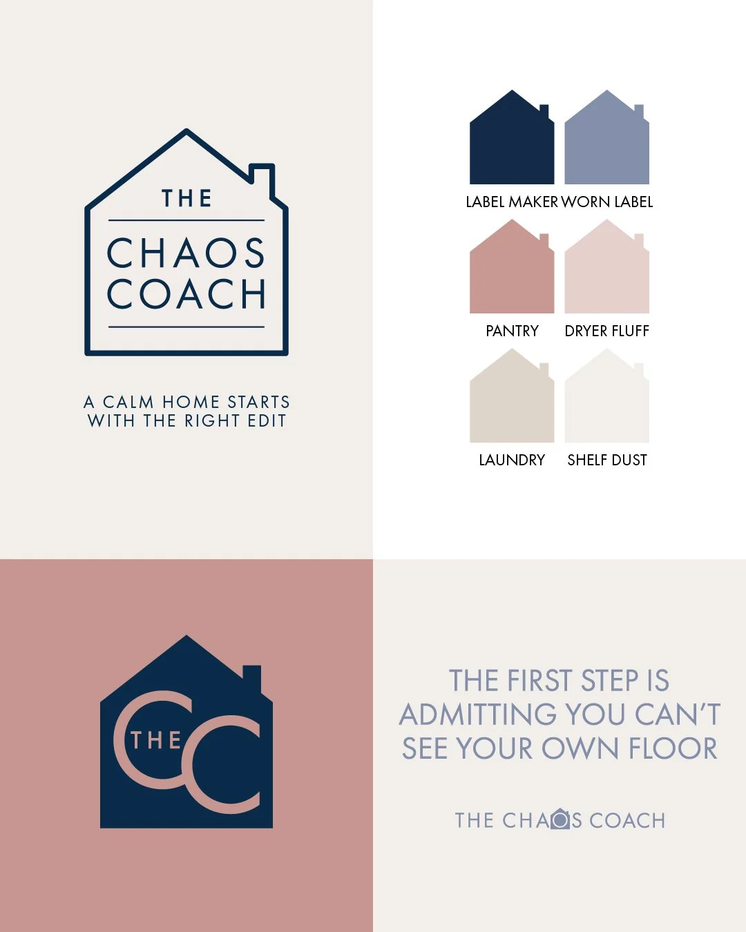
Your logo in all its flavours - primary, secondary, stacked, icon-only, favicon, light, dark, one-colour. The bigger the system, the fuller the suite.
-
Your brand’s paintbox. A custom mix, always. The bigger the system, the more nuanced the shades so you can flex without going off-brand.
-
Your brand’s imagery or photo style on a page - mood, colour, vibe. Light inspo boards at entry level, full imagery guides at the top.
-
The fancy word for fonts - but not just which ones you use, how you use them. Your brand’s voice will be visible in type - fonts chosen to work as a team, with style and staying power. Larger systems get more range and rules.
-
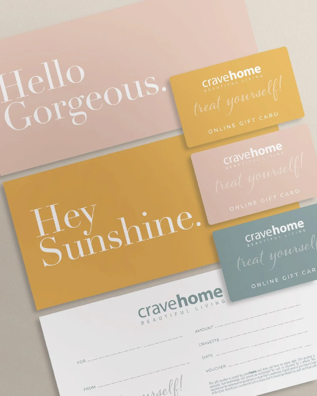
Fancy word for “anywhere your brand bumps into people” - Insta, packaging, receipts, even your mum’s fridge magnet. I like to use ‘brand bits’ because I like alliteration…
-
Your brand’s rulebook. A light cheat sheet in smaller systems, a full manual in bigger ones. Think of it as your stylist on a page - keeping everything pulled together wherever you show up.

You now speak fluent Design & Branding.
Welcome to the club.
Got questions?